TEACHING: The misuse of bar graphs in science (and science education?)
The simplicity of bar graphs makes them a popular tool for data visualization in scientific publications. Indeed, a recent survey of the physiology literature found that 85.6% of papers published within a 3 month span in the field’s top journals included at least one bar graph. But does this simplicity mask the complexity of data and undermine the scientific process?
In a recent PLoS Biology article, Weissgerber et al. (2015) argue that bar graphs are no more than “visual tables”. By simply plotting the mean and standard error, the distribution of the data remains hidden from the reader. Yet the distribution can be critical for proper data interpretation. For example, Weissgerber et al. (2015) plot four different datasets, each of which yields the same bar graph. However, upon closer inspection of the data using univariate scatterplots, the authors reveal that one dataset has a bimodal distribution, another has unequal sample sizes, while yet another has an outlier.
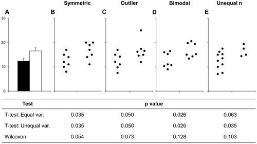
Figure 1 from Weissgerber et al. (2015)
This “messiness” should prompt us as scientists to carefully interpret the data – is the outlier meaningful? Is the distribution really bimodal, and if so, why? Bar graphs actually discourage this kind of evaluation though because the nature of the data is hidden from the reader.
So what’s the solution? The authors recommend that scientists and journals encourage the use of univariate scatterplots, boxplots, and histograms. They even provide some handy templates for making univariate scatter plots in Microsoft Excel (check them out here).
This paper got me thinking about how we teach data visualization skills to our students. I know I have often opted to show a bar graph to students rather than a boxplot because it is easier to present quickly in an already jammed-pack lecture. But does this rob them of part of the scientific process? What are your thoughts?
Full citation for article:
Weissgerber T.L., N.M. Milic, S.J. Winham, and V.D. Garovic. 2015. Beyond bar and line graphs: Time for a new data presentation paradigm. PLoS Biology 13: e1002128. doi: 10.1371/journal.pbio.1002128
________________
This was posted to the QUBES Project Blog. You can subscribe to the RSS feed using this link. Feel free to comment on this post. If you have suggestions for posts that would be of interest to the community please share them here. Thanks.
About the author
Anonymous @ on
One of my favorite, succinct attacks on so-called "dynamite plots" (means + SEs bar plots) is this from Tatsuki Koyama...
Having personally switched in my research to nearly always showing all the data rather than just means and standard errors, I can say: 1) some reviewers hate it, and 2) it looks "messier"... patterns that are "clean" with dynamite plots can look pretty bad... which is fine with me, but I think the uninitiated perceive the patterns/differences as weaker than they are. Points 1 and 2 together may mean I am not really doing myself any favors in the publication process... but as Tatsuki says "Its the right thing to do. " :-)
In the classroom, I still teach both graphical approaches - in part because students will see the typical bar plots all the time, and because other instructors will expect them to make them. This last issue is one I struggle with for statistics in general- should I teach things the way I think they "should" be... or in ways that best prepare students for other courses and the literature? Null hypothesis significance testing anyone? :-)
Reply Report abuse